The Reenvisioned Figma Mirror
Hold the phone ... Figma Mirror just added in-app commenting and collaboration features?
Figma is a web-based design interface that has taken the design world by storm with its easy to use, highly collaborative features. Often described as the Google Docs of design, Figma allows users to collaborate in real-time without the need for third-party apps, like InVision. As a collaborative design interface it serves the needs of its target audience from freelancers to large design teams. In 2020, its major customer industries include technology, business services, telecomm., and finance.

Among the features that sets Figma apart from competitors like Sketch is its compatibility with both MAC and PC, allowing teams of all varieties to work in real-time regardless of their operating system. This all-in-one tool allows designers to create, collaborate, iterate, prototype, and test in the cloud.

The Challenge
Working within the Figma brand, I wanted to reenvision the current Figma Mirror app to add more useful and collaborative features and functionality.
-
allowed users to access their projects without being connected to a laptop/desktop
-
reimagines the way users and teams can collaborate using the Figma Mirror App
-
create more natural gestures which is a major complaint of current users.
Scope & Goal
-
Design a feature that allows users to access and manage projects directly from Figma Mirror/App.
-
Allow users to comment and give feedback on design iteration within Figma Mirror.
-
Update the gestures to avoid user frustration and mimic natural or expected gestures (ie: swipe means change frames)
My Role
UX Research
UX/UI Design
Timeline
2 weeks
The Tools
Figma
Maze
G-Suite
Miro
Asana
Slack
Research & Empathize
Research Goals
-
Understand how users interact with and use (accessing, managing, commenting) Figma Mirror or related apps from InVision and Adobe Xd
-
Understand their preferences when choosing these apps for design projects
-
Understand how they most commonly interact with teams/collaborators on these apps
-
Understand priorities and pain points when using design apps including Figma Mirror, InVision, and Adobe Xd to manage projects or work with a team from a mobile device.
Methodology
Competitor Analysis - looking at the top three to five direct competitors of Figma in an effort to understand their position in the market, their digital footprint, and how we might compete directly.
Survey- preliminary and quantitative analysis of interaction and use habits, preferences, priorities and pain points when accessing projects, managing projects, or collaborating with a team from their mobile device.
User Interviews with Contextual Inquiry - a deeper dive into participants' preferences, expectations, and frustrations when accessing and managing projects on design apps, including contextual inquiry of them using their preferred app to see how they truly interact with the features.
Participants
Users in the design field between the ages of 20-60, who currently use products and apps (Figma, InVision, Adobe Xd, Axure, and UXPin) that compete in this space.
Competitor Analysis

Research Results

Key Insights
Figma users interviewed cited freezing and crashing as a moderate concern with the app, but didn’t expect much from its overall functionality and usability as a mirror.
Both Figma Mirror and InVision users were skeptical of adding or using the comments feature as they find it less readable and useful with the size constraints of most mobile devices.
InVision users cited having to download and then upload work, not having real-time updates between Sketch & InVision, and a preference to work in one software as frustrations that could be fixed by building out Figma’s app.
When asking users if they would normally download an app that was known to only have one feature, 2 out of 3 said No.
Define
Who are Figma & Figma Mirror users?
Personas were narrowed to three types of users, newly-emerging designers, professional designers, and those who made the design investment decisions for companies.
-
design students who choose Figma because it requires the lowest monetary investment among its competitors
-
professional designers who are interacting with the product daily and have collaborative needs beyond their office workspace
-
decision-makers are those users who have the ability to make investment decisions if they feel their teams' needs are met
What are their needs & goals?
-
Ability for individuals and teams to create end-to-end designs that are functional across devices.
-
Simple to use mobile features that allow for communication in real-time.
-
Ability to see, access, and makes comments or notes on projects on the go across devices and without the need for desktop/laptop access.
-
No need to be desktop-driven, shared and saved projects are accessible from anywhere and on any device.
-
Affordable tools that keep designers locked into one source of truth.

Project Goals
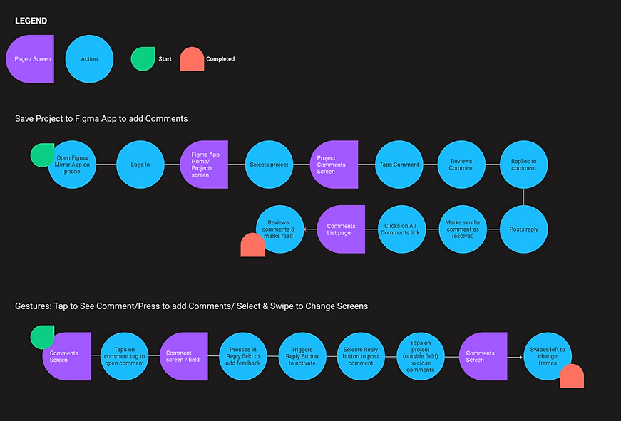
Task Flows

User Flows

Ideate & Design
Maintaining Brand Integrity
From the start of this exploration into the expansion of the Figma Mirror App, I understood the importance of staying in line with the brand. My design goals became:
-
Maintain Figma design patterns
-
Create familiar interactions for iOS
-
consider ways to embody Figma's vision
-
represent the bold, curious, vibrant, and honest personality of the app in design and deliverables.
Designing to Meet Needs: HMW
-
How might we mimic the same features and functionality of the desktop version within the constraints of mobile?
-
How might we maintain familiar interactions but shift them to touch gestures?
-
How might we overcome the skepticism discovered in the research phase to show users that comments on mobile can be easy and useful to their daily collaboration?
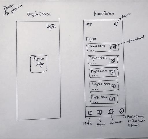
Sketches

_edited_edited.png)


Test & Learn
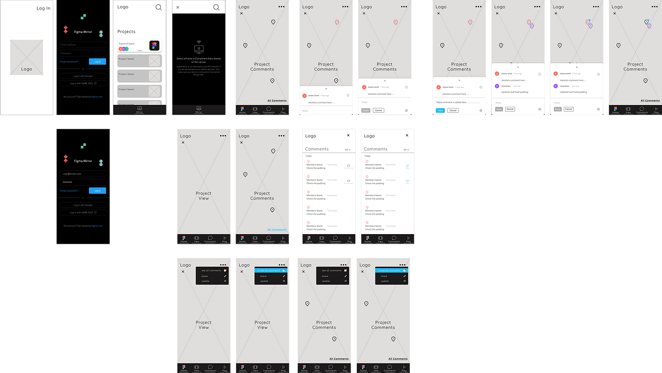
Mid-Fidelity Wireframes & Usability Testing
It was important to test early and as much as possible to ensure that the design met the needs of users and lived up to my design goals. With that in mind, I started with med-fidelity usability testing to ensure that feedback focused on the usefulness, learnability, and familiarity of the features and the following objectives/questions:
-
What friction, misclicks, confusion are we discovering as users navigate the app?
-
Are users following the most direct path to complete tasks?
-
Are the tasks for commenting, navigating, and returning to the global navigation intuitive?
-
If difficulties were present, dig in by requesting users' open-ended feedback.
v1
Moderated Usability Testing of Mid-fidelity Designs
Participants
-
Number of Participants: 6+
-
Age Range: 20-50
-
Participants are within our target user audience and personas.
Recruiting Plan
All participants will be recruited based on survey feedback and experience using the Figma Mirror App or InVision App.
Tasks & Flows Tested
-
Comments Interactions - Read, Reply, Resolve
-
Local Navigation- View Mode & Comments
-
Local to Global Navigation - Access Figma Mirror
-
Menus- Share Project link

What I Learned
In a moderated usability test, users felt that the comments cards were not as familiar and should look exactly as they do in the desktop version. Feedback led to the following improvements:
-
Comment cards were updated to mimic the desktop version. The initial concern about this surrounded device size constraints, but I was able to mimic the card at a feasible size and height.
-
A comments list was added that mimics the Figma desktop version, allowing users to view all comments on the project in one screen.
v2
Remote Unmoderated Usability Testing via Maze
Participants
-
Number of Participants: 6+
-
Age Range: 20-50
-
Participants are within our target user audience and personas.
Recruiting Plan
All participants will be recruited based on survey feedback and experience using the Figma Mirror App or InVision App.
Tasks & Flows Tested
-
Comments Interactions - Read, Reply, Resolve
-
Local Navigation- View Mode & Comments
-
Local to Global Navigation - Access Figma Mirror
-
Menus- Share Project link

Mid- Fi Usability Testing Results

Issues & Insights
-
Home Screen Access- In reviewing the heat maps, users did not intuitively use the Figma logo at the top left of the screen to return home. Some felt lost in their attempt to return from the local to global navbars.
-
NavBar Access- The comments card was covering or hovering over the navbar, and some users weren't certain how to close comments to access the navbar options.
-
Action Icons- When instructed to close the comments card, many users did not intuitively click outside the card.
-
Navigation - Some users found it unfamiliar that the global navbar on the home screen became a local navbar once in the project.
-
Links- Users most often misclicked when asked to access the All Comments List.
Solutions & Revisions
Original

Navigation - The initial global nav bar was removed
-
the user account moved to the top right of the Home screen
-
Mirror access became a button that floats the Home screen
-
the Project screen remained home.

NavBar Access- The comments card was moved up above the navbar so as not to obstruct user interactions.
Action Icons- A close option in the form of a chevron was added to the top center of the comments card to make it easier to close.
Home Screen Access- The addition of the Figma logo in the navbar allowing users to quickly and easily jump back to the home screen

Links- All Comments link moved to the menu to avoid crowding the bottom of the screen, misclicks, and confusion between the Comments screen and the All Comments List.
Revision


Hi-fidelity Designs v1

Hi-Fidelity Usability Testing - Remote via Maze
Participants
-
Number of Participants: 6+
-
Age Range: 20-50
-
Participants are within our target user audience and personas.
Recruiting Plan
All participants will be recruited based on survey feedback and experience using the Figma Mirror App or InVision App.
Tasks & Flows Tested
-
Comments Interactions - Read, Reply, Resolve
-
Local Navigation- View Mode & Comments
-
Local to Global Navigation - Access Figma Mirror
-
Menus- Share Project link

Hi- Fi Usability Testing Results


63 percent of users rated these added features as Useful to their daily design work, while an additional 25 percent rated it Very Useful.
67 percent of users tested use Figma and Figma Mirror Every Day in their design work.
What this means ...
Overall test results were a bit surprising. Six of the eight users accessed the test on a desktop/laptop even though the test was labeled as mobile. Major issues among desktop/laptop testers revolved around having to click twice and one target not working leading to a high bounce rate.
When analyzing the Maze heatmaps and user paths, I could see that these tasks and screens were enabled with specific mobile gestures, such as press to add comments, and touch up and touch down to show feedback on state changes in menus. When performed on a desktop/laptop device they would not have functioned as they should in mobile.
Yet even with some technical or device issues, 7 out of 8 users rated these features as Useful or Very Useful to their daily work.
Hi-Fi Design - The Reenvisioned Figma Mirror App iOS


When users log in to Figma Mirror they are taken directly to the Home Screen - Projects.


Users can quickly and easily select from their list of projects. They also have quick access to Mirror from the Home Screen.
Mirror offers two options to return users Home, with a Home Button that floats the screen and a close option.
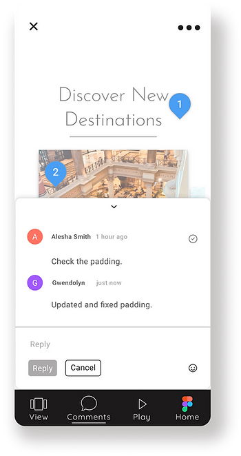
Once in a project, users can easily see Comments and activity on their team projects and specific comment sections highlighted by active comment pins.
Gestures are updated to account for added commenting features. Users simply Tap on the Comment Pin to display and reply to specific comments within the project.
Users simply tap into the reply field to add a response. Once a reply is added, the Reply button will become active, allowing users to quickly post.


Like Figma desktop, the Reply button returns to the default state once a comment is posted. Comments are denoted with the user's icon and time stamp.
The resolve button allows teams to make quick updates and indicated to team members that changes have been made.

Users can easily turn off comments pins and switch to View mode through a tap on the screen or by selecting View in the navbar.
Like Figma desktop, menu options allow users to access a full list of comments and filters.

From the Comments List, users can quickly see read, active, and unread or new comments and tap on the comment if they wish to see it as a pin in the project and reply.

Next Steps ...
-
Build it for Android-To live up to the platform-friendly, open-source, community-driven, and accessible vision of Figma, my next step is to build this app out for Android users.
-
Add Prototyping to the Mix- In user interviews I asked if they thought being able to prototype directly in the app would be helpful to their design work, and a resounding majority said yes, but couldn't picture what that would look or function like. Being inspired by this project, creating a useful tool for the design community, and supporting the vision of rockstar companies like Figma led me to this idea.
Lessons, Reflections & Takeaways
What Seems Obvious May Not be That Obvious
Although initial designs were made with the assumptions of naturally intuitive actions and gestures, such as tapping outside of the comment card to close, users did not recognize it intuitively. They wanted clarity in the form of an icon to close the cards.
Users Crave Familiarity
In initial research, both Figma and Invision App users were skeptical about the usefulness of commenting on a project within the constraints of a mobile device. This led to the initial design of individual floating comment cards that were more similar to popular chat apps like WeChat and Google Hangouts. Yet, the first round of moderated testing showed that Figma users wanted and expected the comment card to look like Figma desktop.
Boy, did I ever learn this one! The more I tested, the more I understood the needs of the user, their expectations, and their frustrations. Starting with med-fidelity testing was also incredibly important, as it removed the design from the focus and was just about usability.
Testing, Early and Often
Figma Android
