
The Reenvisioned Figma Mirror App for Android
The Comment-taking, Prototype-making all-in-one app that just took design to a whole new place - your mobile phone!
In a world made up of Android and iOS, companies entering the app market must consider that not all of their customers are device or platform loyal, and in an effort to reach users they must consider building for both sides.
This is especially true for companies like Figma, who broke into the market by offering a freemium design software that was accessible across desktop platforms, such as Windows or Mac OS. This market-entry strategy positioned Figma to differentiate itself against major competitors, like Sketch, which is only available on Mac OS and lowered the barrier to entry for new users.
My recent reenvisioning of Figma Mirror for iOS has taken it from a single-feature app to an interactive, multi-feature tool that allows users to collaborate and work in real-time from anywhere, without the need for desktop access.
In line with Figma’s vision of a design tool that is highly accessible, borderless, community-driven, and open-sourced, I am proposing to build the app from its current iOS state to Android, making it truly accessible across devices and platforms so users can work from anywhere on any device.
The Challenge
Translate the iOS features to Android following the Materials Design system of Google and add features as well, including:
-
an in-app prototyping feature
-
familiar prototyping interactions within the constraints of a mobile viewport.
-
the careful balance of Materials Design System and how it may complement Figma's design patterns.
-
user account access
Scope & Goal
-
Design an additional feature that allows users to create or edit a prototype directly in the app.
-
Allow users to access their account on mobile
-
Bring all the added features together in a way that serves both iOS and Android Figma users- helps them achieve their goals daily and is a meaningful addition to their daily work.
My Role
UX Research
UX/UI Design
Timeline
2 weeks
The Tools
Figma
Maze
G-Suite
Miro
Asana
Slack
Discovering The Why

Why Build for Android?
While iOS is the dominant player in the US market, worldwide Android holds over 85 percent market share in the mobile/smartphone space.
Between 2018 and 2019, Android showed a pattern of steady and sometimes significant growth in major markets, especially OECD countries, whereas, looking at the same data on iOS, in places where they have not remained flat they have seen a decline in users.
Research
Research Goals
-
Understand how many Figma users prefer and use Android vs iOS.
-
Understand if they use any similar prototyping apps for design work.
-
Understand any skepticism (real and/or perceived) about prototyping app tools.
-
Understand priorities and pain points associated with prototyping tools in general.
Methodology
Competitor Analysis - looking at the top three in-app prototyping competitors of Figma to explore their features, user feedback/ratings, accessibility on platforms (Android & iOS), product range, and any associated costs.
Survey- preliminary and quantitative analysis of preferences, interaction and use habits, skepticism, priorities and pain points when prototyping on a mobile device.
User Interviews with Contextual Inquiry - a deeper dive into participants' preferences, expectations, and frustrations when prototyping, interacting, and testing with design apps, including contextual inquiry of them using their preferred app to see how they truly interact with the features.
Participants
Users in the design field between the ages of 20-60, who currently use products and apps (Figma, InVision, Adobe Xd, Marvel/POP) that compete in this space.
Competitor Analysis

Research Results

Insights & Validation
None of the participants surveyed or interviewed had heard of or used POP or Marvel apps.
When it comes to daily design work, 5 out of 5 participants said they use their desktop/laptop most often, yet, when managing their schedule, communicating with others, and keeping track of reminders/appointments, 40 percent use their mobile most.
Once again, all participants were skeptical about the capability of prototyping on mobile, citing screen size as the number one concern, and functionality of gestures to “control the process without constant frustration” as a close second.
One of the challenges will be overcoming the skepticism of mobile constraints and showing users the same ease of functionality, familiarity, and usability of gestures in prototyping that they apply to their normal interactions with mobile.

Defining the Product for Users
Who are Figma users?
In addition to the personas created based on the research phase for iOS, I wanted to consider one additional group of users - the Agile Designer.
-
Works in a fast-paced environment often spread across the country and globe as remote workers.
-
Manages 2-weeks sprints that require designers to be plugged in whether they are in an office, between locations, or in a client-facing meeting.
What are their needs & goals?
-
Ability to quickly access and update prototypes to meet client needs in the moments the need is discovered.
-
Simple to use mobile features that allow for prototyping creation and edits in real-time.
-
No need to be desktop-driven, shared and saved projects are accessible from anywhere and on any device (android or iOS).
Defining the User

Defining the Goals

Prioritizing Key Tasks

Simplifying the User Flows
Designing the Product for Users
Balancing Android with Figma Design
Designing to Meet Needs: HMW
I understood the importance of staying in line with the design patterns of Figma, while also incorporating Google Material Design principles and requirements. My design goals became:
-
Maintain the Figma design patterns in Material Design
-
Create familiar Android-friendly interactions
-
Design recognizable UI across platforms
-
Represent the bold, curious, vibrant, and honest personality of Figma products.
-
How might we mimic the same UI/UX and functionality of the iOS version to make the app both learnable and memorable on Android?
-
How might we maintain interactions Figma users expect but incorporate the native gestures of Android?
-
How might we overcome the skepticism discovered in the research phase to show users that prototyping on mobile can be easy and useful to their daily work?
Low- Fidelity Design Ideas
Initial designs tested a number of navigation options. My major concern was crowding the interface at the bottom since Android phones have a built-in navigation bar.
Propositions included:
-
a Nav Drawer (shown below) and native to Android with tabbed contextual menus
-
a bottom App Bar with navigation drawer (easy to reach) and a FAB for Mirror access
-
a more traditional bottom navigation that appears once users have selected a project on the Home Screen, and no tabbed context menu.

As the design moved forward, it was best to stick with the traditional bottom navigation bar to maintain familiarity and consistency for users between the iOS and Android versions.
Mid- Fidelity Wireframes
Flows from iOS version
-
Open & View Omega Project
-
Use Comments Feature
-
Access Comments List
Access Projects & Mirror
Added Flows
-
Prototyping Flow
-
Access User Account
Comments Flow

Prototyping Flow

Account Access

UI Kit- Android

Hi-Fi Design v1- Prototyping Feature
Hi-Fi Design v1 - Additional Screens
Original iOS Screens- Home, Comments, View & advanced actions menu

Android Screens- Home, Comments, View & advanced actions menu

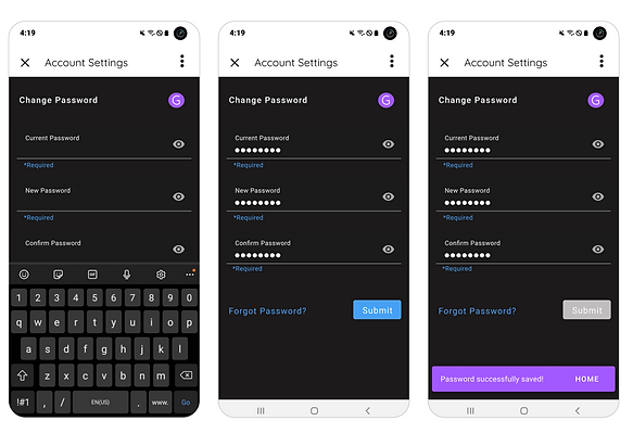
Access User Account

On the screen where participants were supposed to preview and play the prototype, a large majority of users did not intuitively use the play button at the bottom of the screen. Instead, they clicked directly into the prototype preview screens.
Two possible fixes:
Ensure that the Play FAB floats the screen as intended to keep it in plain view of the user and within the context of the expected behavior or action.
Place a play button on top of the preview screens.


Screen 4- On this screen users are prompted by a tooltip to choose an animation. The tooltip is anchored at the
top of the screen, further away than it should be from the Animation section.
A simple solution is to move the tooltip down, having it appear adjacent (as it should be) the animation area. This would allow users to easily connect the prompt with the intended behavior or action.

Testing & Improvements
Hi-Fi Usability Testing
Objectives
-
Ensure new/target users can navigate the apps added features without stress or friction.
-
Ensure users can easily recognize and navigate using icons and menus.
-
Observe and gather feedback on any areas that create stress, confusion, or friction for users.
Tasks
-
Open & View Omega Project
-
Use Comments Feature
-
Access Comments List
-
Start Prototyping
-
Add to Prototyping Path
-
Access User Account & Update Password
Hi-Fi Usability Results
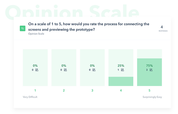
Usability Rating of Primary Flows
Key Improvements
Original


Select Animation Tooltip was moved to the bottom of the screen adjacent to the Animation area
Revision


The original Mini FAB was replaced by a wide FAB with both text and icon. It was moved closer to the preview screens to provide more context for the interaction.
Original
Revision
The Reenvisioned Figma Mirror App for Android
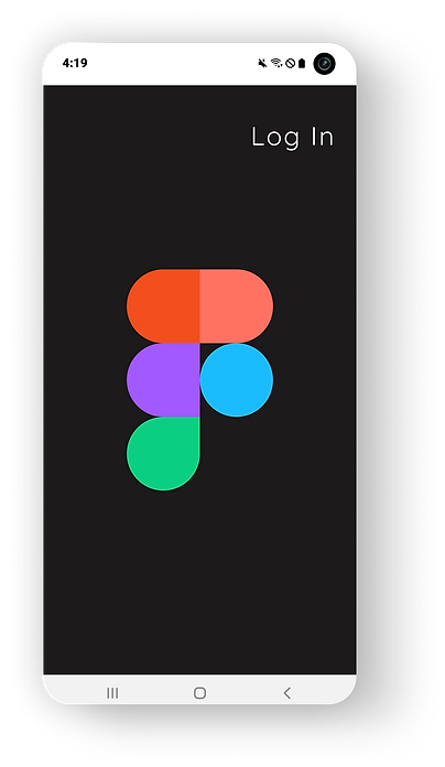
Log in page is kept uniform to Figma Mirror design with one exception - the Wordmark has been updated to match their brand kit.


Home screen is consistent between iOS and Android and updated to include Android specs.
Users can easily access Mirror from the Home screen and quickly return home using the FAB.


Users are given the option to prototype existing Figma projects or create new projects by uploading a photo from their camera roll, uploading a png file from a cloud app, such as Drive or Dropbox, or taking a photo with their phone,
They can also crop the project to specific phone/device sizes by simply choosing a device option.


Screens are shown as thumbnails making the process feel more familiar to working with a photo album on thumbnails on mobile.
A simple tap will choose the starting screen and then users are guided through the process with tooltips that can be disabled.


Using native gestures to Android, users can pinch to expand or shrink their hotspot.
Simple animations allow the user to enhance transitions between screens.


For learnability and memorability, the process is repeated as users select their destination screen.
A preview of the prototype screens gives users feedback and play to check that transitions are correct.
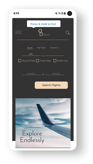
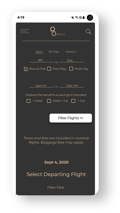
Screens are played in full-screen and the user interacts with hotspots using familiar mobile gestures, such as a tap.
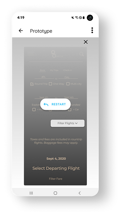
Once the play preview is complete, users have the option to:
a) tap the screen and replay
b) tap close and use the save option
Save & Continue will allow the user to add additional screens to the path.

I took on this project as a curious user who saw the potential for a more interactive version of Figma Mirror. Inspired by the amazing tool the Figma crew built for desktop, I knew I could take those same design patterns, the same solutions, and the same sense of inclusive design and apply it to both the iOS and Android versions of this app. I won't say it was truly 'easy' but coupled with a great mentor and clear user feedback, it was among the most naturally evolving designs I have had the pleasure to create.
Stick with what works, even if users don't know it yet
What surprised me the most in all of this is how skeptical users were about comment features in the iOS phase and prototyping features in the Android phase. When surveyed and interviewed, the same users shared that they manage their daily activities on mobile more often than on desktop, they chat and post on social media like FB, Instagram, and Twitter, and some even use apps to edit videos for Youtube and Tiktok on their mobile phones - yet they were skeptical about leaving and retrieving comments on Figma projects and working on moving prototypes on their mobile phones. So, while designing this tool to look and feel like what users expect from Figma desktop, I also tried to incorporate design patterns that felt familiar beyond Figma.
Lessons, Reflections & Takeaways
When you Believe in Something, it is Easy to Envision -
Testing, Early and Often
Yep, I am sticking with this one! Early and consistent usability testing during the iOS phase saved a great deal of time during the Android phase. I could focus more on making the app work within the framework and guidelines of Material Design, smoothing out the interactions and navigation, and making the feel of prototyping less daunting to the user by taking a two-screen at a time approach to path building. This led to the 4th and best usability test for the app and users rating the processes and navigation as Easy to Very Easy.
Next Steps ...
-
Build out additional flows and UI- With my focus on on-the-go prototyping specific to Figma users who would be accessing existing projects, I have not yet built out all the flows or additional UI for users who wish to prototype by importing a photo from their phones camera role, uploading a file from a cloud-based storage app (Google Drive or Dropbox), or taking a live photo and prototyping it directly.
-
Iterate & Improve- There is always room to improve the overall functionality of the app, simplify interactions, and find ways to help users get things done without even thinking about "mobile constraints.' Continued user testing will be more indicative of overall friction and shine a light on ways to make this app the best on the market.
-
Add the prototyping and user account access features to the iOS version of the app to ensure that both platforms are the same.
Stay tuned ...


